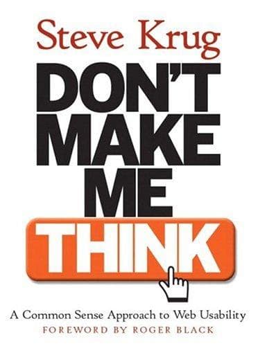
Don't Make Me Think
by Steve Krug · Published 2000
One of the best UX books for grasping a simple principle: a user should never have to spend extra thought just to use your product. Short, practical, and still entirely relevant to web and product design.
What works
- Extremely practical.
- Short and accessible.
- Excellent principles for web and product design.
- Still relevant decades after publication.
What doesn't
- Some examples are dated.
- Focuses primarily on usability rather than the full UX discipline.
- Doesn't go deeply into research or interaction design theory.
Summary
In Don't Make Me Think, Steve Krug lays out one of the simplest yet most widely applied principles of interface design: a user should never have to think extra hard just to use a product. Every time a user hits a mental question mark — "what does this button do?", "where am I on this site right now?", "how do I get back to the previous page?" — a slice of their limited mental bandwidth, which should be going toward their actual goal, gets wasted.
The book is short, direct, and openly consistent with its own claim — it tries not to make the reader think extra hard either. Instead of abstract theory, Krug offers concrete examples, real screenshots, and practical recommendations directly applicable to any website or digital product.
The book's underlying message is that good usability doesn't require a huge budget or elaborate research. Krug argues that many common interface problems can be identified and fixed just by knowing a handful of simple principles and running regular, low-cost usability tests — a view that makes the book practical even for small teams without extensive resources.
Key ideas
1. The core principle: don't make the user think
The book's title is exactly its central thesis. Krug argues that when you design a page, the main goal should be that a user, without needing to pause, analyze, or guess, immediately understands what's in front of them and what they need to do. Anywhere a user has to stop and think "what does this mean?", the design has failed — even if they eventually find the right answer.
2. Billboard Design 101
Krug introduces a well-known metaphor: web page design should be like billboard design on a highway — something comprehensible in a few seconds while speeding past, not text meant to be read word by word. Users typically don't read web pages; they scan them, hunting for familiar visual cues, and click on the first thing that looks "good enough."
3. The trunk test
One of Krug's practical exercises for evaluating a page is this: imagine someone blindfolds you, puts you in a car trunk, and drops you in the middle of an unfamiliar web page — can you immediately say what site this is, which page you're looking at, and how you can navigate around it? If answering any of these questions requires extra digging, the page's design has failed to communicate context instantly.
4. Cheap, frequent usability testing
Krug pushes back against the common belief that usability testing requires a big budget and specialized labs. His practical recommendation is: test with just three or four users, informally, roughly once a month. In his view, testing with a small number of users, but repeatedly over time, delivers far more useful information than a single large, expensive study.
5. Cutting "happy talk"
Krug uses the term "happy talk" to describe unnecessary, self-congratulatory introductory text — sentences like "Welcome to our site, we're proud to..." — that keep users from quickly reaching their goal. His recommendation is blunt: cut this kind of text ruthlessly. Users didn't come to your site to read introductory pleasantries; they came to accomplish a specific task.
Who it's for
- Web and product designers, even without a formal UX background — the book's principles are simple, practical, and immediately applicable.
- Small teams and startups with a limited budget for user research — Krug's cheap, frequent testing method is built exactly for that context.
- Anyone newly entering the field of user experience — the book is a very readable, short entry point into the field.
- Anyone looking for theoretical depth and academic UX research — the book focuses more on usability than the full discipline of user experience or interaction-design theory.
FAQ
What is the core principle of "Don't Make Me Think"?
A user should never have to analyze or guess just to use a page or product. Every moment a user pauses to figure out what to do is a sign of a design weakness.
What is the "trunk test"?
An exercise for evaluating a page: if a user were suddenly dropped in the middle of that page with no prior context, would they instantly understand where they are, what site this is, and how to navigate? If not, the design needs revisiting.
Why does Krug recommend testing with a small number of users?
Because he believes testing with three or four users, done repeatedly and consistently, yields more actionable information than a single large, expensive study — and it's achievable for teams with limited resources too.
What is the "happy talk" the book criticizes?
Unnecessary, self-congratulatory introductory text that delays a user from quickly reaching their goal. Krug's recommendation is to cut this kind of content ruthlessly.
Is this book still relevant today?
Yes, its core principles — reducing cognitive load, instant clarity, scannability — are independent of any specific technology and still apply to today's interfaces, from websites to mobile apps.
Was this useful?
Counts appear once there are 5 votes.